From August 2023 to April 2024, after 8 months, 1000+ commits, and countless sleepless nights v3 is finally here — the biggest, most feature packed release in the history of Notesnook.
In this release we have rewritten the core architecture of Notesnook, introducing a new Sync Engine, migrating to SQLite, adding support for internal note links, tabs and nested notebooks, alongwith countless big and small improvements to the UX. v3 is the rebirth of Notesnook as a more mature, more stable note taking experience.
There's a lot to talk about in this release but let's start with the new Notesnook logo.
The new Notesnook logo
When we started out building Notesnook, our logo was the literal visual representation of "notes" and "nook". That concept quickly got outdated after rapid iteratation that completely changed how Notesnook functioned. Despite all the changes, though, we are still engineers at heart which means we think of everything in terms of "problems" and "solutions". The old logo had a couple of problems:
- It wasn't legible in small sizes (e.g. favicons, tray icons, status bar icons etc.)
- It couldn't be themed
- It didn't work well with different colors
- It had a very busy design
The new logo solves all of these problems and it looks great.


Migrating to SQLite
If you have been using Notesnook you would never notice that all of it is built on a very simple key value database. KV databases are really cool but fail miserably if you want to selectively query data, or do partial updates. As a result, when you increase the number of notes in Notesnook, the performance becomes abysmal. I am talking about 30+ seconds to startup the app with 50K notes on iPhone 6s, laggy scrolling, and a simple note taking 10s to save on each edit.
Since this only occured for 20K+ notes, we could afford to be slow for some time but sooner or later we needed a permanent solution. We had the following options:
- Optimize the slow parts of the database (essentially building our own database & query engine) and continue shipping.
- Migrate to SQLite
Building your own database engine is really not a good idea. I wish we had seen this while prototyping Notesnook because while choosing a KV database sped up development it forced us to repay that cost later on. Using the right tool for the job is crucial for any serious software development.
To decide our next steps, we set down a few targets:
- The clients should perform predictably regardless of how much data you have. Loading 1000 notes should take the same amount of perceivable time as loading 50K notes (i.e. using lazy loading, pagination etc.)
- The clients should use as little RAM as possible to work in extremely constrained enviroments (e.g. our web clipper shouldn't crash on iOS which limits all Share Extensions to around 50mb of RAM).
- Instant startup times regardless of how many notes a user has.
- Future proof (i.e. we shouldn't need to migrate again)
And a couple of good to haves:
- Scrolling a list with 50K notes at 60 FPS
- Improved search
- Faster saving of notes
Keep the above in mind, the choice was obvious: it was time to migrate to SQLite.
In v3, you will notice the following improvements immediately:
- Instant startup even with 50K+ notes (1.5s vs 30s on iPhone 6s)
- Lag free scrolling & navigation
- Exporting notes & taking backups should be faster
- Search should be faster and more accurate
- Faster sync (thanks to the power of SQL)
- Web clipper on mobile should no longer crash if you have a lot of notes
After migration, the next obvious step was fixing the sync. Specifically we wanted to fix one of the longest standing issue with Notesnook Sync: a change you make on one device sometimes wouldn't sync to other devices and vice versa.
Fixing the sync
From the beginning, Notesnook has had a decentralized sync system where each client can independently sync items without depending on a central server. This could only work based on time, of course, but it also had a few drawbacks:
- Since each client was independent, it was a nightmare to debug why something wasn't syncing.
- In order to be efficient, we detected changed items based on their modified timestamp but this forced us to juggle with the various inconsistencies of time on different devices.
- Building everything on top of timestamps meant resumability during sync could never be stable.
As you can imagine, in order for a time based sync system to work without issues, time must be the same on all devices at all times. What happens if one device is ahead/behind by a few milliseconds? Items get missed out of the sync cycle, and you have to run a force sync (which sends & fetches all the items instead of only the changed ones).
It was clear that to properly fix the sync we had to get rid of the time factor. Turns out a centralized architecture is the best way to solve this problem:
- Each item has a boolean
syncedproperty that becomesfalsewhenever it is changed. - When pushing changes, we just get all the items with
syncedset tofalse. - The server keeps a list of all unsynced items for each device, and when a device runs the sync it only sends those items.
This fixes all the problems with a time based sync engine:
- Debugging is easier because server has a list of all changes for each device.
- Detecting changed items is just as efficient as comparing their modified time but more stable.
- Resumability comes built-in.
As a result, in v3 you'll notice a much more reliable sync that "just works" regardless of where you are, how many devices you are on, or the time difference between them.
Background sync on mobile
Notesnook mobile apps will also now automatically sync your notes and other data in the background at regular intervals. This will ensure that you are always synced even if you never open the app. For example, setting a reminder on the desktop/web app will automatically set it on your phone as well (without requiring you to open the app).
Background sync can be disabled from Settings > Sync Settings > Background sync.
Merge conflict tolerant sync
In v2, whenever a merge conflict occured the sync would stop until you resolved all the conflicts regardless of whether you made changes in the conflicted note(s) or not. This was quite frustrating.
In v3, we have fixed this: the app will now continue to sync even if you have merge conflicts.
Features, Features
It is always a struggle to decide which features to add and which features to leave for later. v3 is no different but even then, it is probably one of our biggest releases ever.
Note linking
The Crown Jewel of v3!
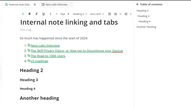
After a long excrutiating wait we have finally added support for linking 2 notes in Notesnook. Not just that, you can also link directly to a specific block inside a note. Clicking on the internal link takes you directly to that block.

We also added controls to quickly see which notes are currently linked, and which other notes are referencing a particular note.

To keep things simple, a note link is no different than a normal hyperlink except that clicking on it will take you to the note instead of an external page. When you export your notes, your note links are automatically resolved to actual Markdown/ HTML files. This is something no other app (that I know of) does instead keeping the links in their app specific format (with note id and everything) making them essentially useless after export.
Tabs
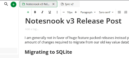
The only reason we added tabs was to allow quick navigation to/from a note on clicking a note link. You can, of course, use tabs without ever linking a note.

Notesnook is one of the few note taking apps (besides Obsidian & OneNote) that has a full fledged tab experience. With v3, we are slowly upgrading Notesnook to become a poweruser's tool while keeping things just as simple as before. Which brings me to...
Nested notebooks
With v3, we are getting rid of "topics" as an organization concept, and replacing it with "subnotebooks". All your topics will automatically convert to subnotebooks after upgrading to v3.
Subnotebooks function similar to a topic except that you can have unlimited levels of subnotebooks. For example, a structure like this was not possible in v2:
- Blogs
  - Programming
    - JavaScript
    - Python
    - C++
  - Privacy
    - Notesnook
    - Android
      - GrapheneOS
      - Other OSs
Complex structures like this are now possible in v3, and they work just like they did in v2 so you'll feel right at home.
At rest encryption
Notesnook was always end-to-end encrypted i.e. your notes always got encrypted on your device before being sent to the cloud. However, those notes weren't stored encrypted on your device. For some users, this was a big no-no.
With v3, we are fixing this short coming of Notesnook. Thanks to SQLite (and sqlite-multiple-ciphers), at rest encryption is now a thing on all platforms. When you first open the app, it will automatically generate an encryption key and store it securely in the platform KeyStore/KeyChain. This encryption key is then used to encrypt/decrypt the SQLite database.
In other words, it "just works" without any intervention required on your part. All sensitive data is encrypted except:
- App logs
- On-device settings & configuration
App lock
At rest encryption works with or without app lock, but it is recommended that you enable it nonetheless especially on the web app where there is no platform KeyChain/KeyStore.
Web/Desktop
When you enable app lock, it further encrypts your database encryption key with your app lock pin (or security key) so it's not just an "overlay". If you forget your app lock pin, the only way into the app is to reset & clear the database and start over.

You can also setup app lock with your hardware security key (e.g. YubiKey/SoloKey) on Chromium-based browsers & the desktop app. Firefox & Safari, unfortunately, still do not support the prf extension which is required for this to work.
iOS/Android
On iOS/Android, the app lock is independent of at rest encryption i.e. setting up app lock doesn't further encrypt your database encryption key with the app lock credential (e.g. password/biometrics). This is done intentionally due to the following limitations:
- Background sync cannot work if app lock is turned on.
- Snoozing/dismissing of reminders becomes impossible because the database cannot be opened without asking the user for the app lock credential.
- Web clipper on mobile cannot work for similar reasons.

However, this is not a huge concern because the database encryption key is already stored very securely in your phone's KeyStore/KeyChain. In the future, we plan on working around these limitations or offering a "Super Secure" mode as an opt-in feature on mobile to disable these extra features.
Export attachments with notes
In v3, we have improved the export process to include:
- Attachments are now exported as separated files (both files & images) instead of getting embedded inside notes.
- Notes are automatically organized based on the notebooks they are in.
- Internal note links are resolved to actual HTML/MD files
- Notes & notebooks with duplicate names are now properly renamed for deduplication.
User profile
In v2 we added the ability to personalize Notesnook using themes and in v3 we are taking that a step further by allowing you to set up your profile. This will add a personal touch to your Notesnook experience. As always, everything is 100% end-to-end encrypted included the profile picture.

Currently your profile is only used for aesthetic purposes. However, in the future we plan to make use of it for Monographs (optionally), collaboration etc.
Custom colors for note organization
Each person has their own color hierarchy. For some, red signifies importance but for others it has a different meaning. Some people can't tolerate a certain shade of red etc. etc. That is why in v3, we are introducing custom colors for organizing your notes.

You can add as many colors as you like with whatever shade you like. No 2 colors can have the same shade, however.
Customizable side bar
The side bar is now fully customizable including:
- Hiding items you don't use
- Changing the order of items (e.g. move Notebooks to the top)
- Reorganizing the order of shortcuts & colors

It can be as simple or as complex as you want.
Callouts
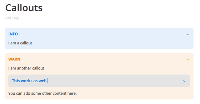
With callouts you can make certain sections of your notes "pop" for better readability. Initially, we have added around 20 types of different callouts which should suffice.
Callouts are also collapsible and nestable so you can add a callout inside a callout etc.

Adding a new callout is as simple as:
>info Callout Title
Table of Contents
If you have very long notes with a lot of headings, navigating around can become really painful. In v3, we have added support for Table of Contents so you can quickly jump around without a lot of scrolling.

Custom titlebar on Desktop app
A desktop app should look and feel like a desktop app instead of just a wrapper around a web app. In v3 we are bringing a fully custom title bar with integrated editor tabs to make things feel more "desktop-y".

With this change, we are making more and more use of the native capabilities of the platform. Even though the web and desktop apps feel similar in functionality, their underlying implementations vary a lot:
- Desktop app has native encryption, hashing & compression making sync and other things quite a bit faster.
- Desktop app supports automatic backups that get saved to a folder on your disk.
- At rest encryption keys are stored in the platform KeyStore/KeyChain in the desktop app, making it much more secure.
- System tray integration only exists in the desktop app
- And many other things that really makes a difference.
Change highlighting in merge conflicts
If you get a lot of merge conflicts, or if you are just comparing 2 note versions, it can become really difficult to figure out what actually changed. In v3, we have added change highlighting on all platforms when viewing merge conflicts or note versions.

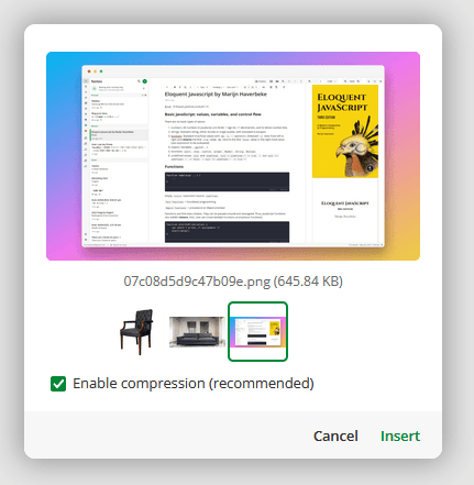
Image compression & multi image upload
Ever since we added support for attachments, we have avoided compressing images to allow users to attach images in their full quality. The drawback of this approach is that on some slower platforms like mobile, loading notes with a lot of images becomes extremely slow and laggy. Another point to consider is that not all images need to be added in their original quality (e.g. receipts, screenshots etc.).
To fix this performance issue, we are now enabling image compression by default with a toggle to disable it for specific images.

Other features
- Add support for copy/pasting code blocks with syntax highlighting.
- The top bar in note properties sheet now remembers which actions to take more frequently and moves the to top automatically. For example if you use the "Copy" action a lot, it automatically moves to start. We have also moved most toggles and single click actions to top bar from the bottom grid.
- Simple checklists — sometimes you just need a simple checkbox without all the fancy task list features. In this beta version we have added just that. Checklists are barebones version of task lists being extremely lightweight and simple to use.
- Drag/drop notes & notebooks — you can now drag drop notes and notebooks just like you'd do files on your file browser. Drag a note to a notebook, color or tag and it'll automatically get assigned. Or maybe drag a notebook to another notebook and it'll automatically become its child.
- You can now sort/group your notes by both title & date.
- We have added a "New Note" Quick Settings button on Android.
Get v3 now!
This release was one of the most stressful releases ever taking over 8 months of development, and countless hours of testing. None of this could ever be possible without the feedback from our beta users. For the last 3 months, our beta users have helped us find countless bugs & inconsistencies, and we could not be more grateful! Thank you to everyone who contributed, helped, motivated, and shared their feedback.
You can grab v3 from our official website, and also from the respective app store on your platform.

